Email Newsletter Layout: The Essential Design Guide


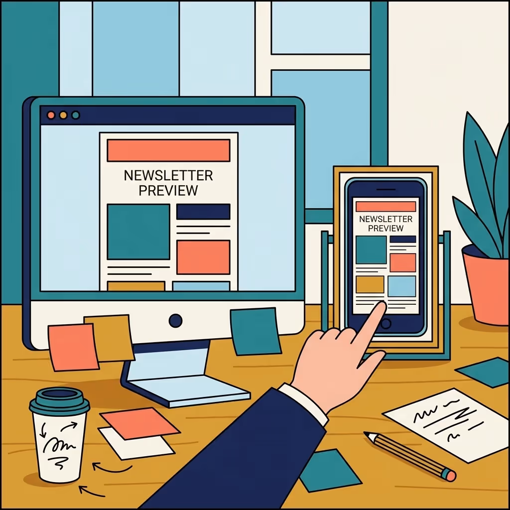
Your email newsletter layout often determines whether subscribers actually read your content or close the tab within seconds. A clear visual structure gives busy people a fast way to understand what matters, in what order, and what to do next.
When layout is intentional, readers can skim, find the one thing that is most relevant to them, and act on it without friction. This guide walks you through a practical process for designing a layout that looks polished, supports your goals, and is easy to repeat issue after issue.
Outcome: What You Will Have By The End
By the end of this guide, you will have a repeatable email newsletter layout that highlights your key message, guides the eye in a logical flow, and makes your calls to action hard to miss without feeling pushy.
Prerequisites: What You Need In Place First
You do not need to be a designer to create a strong newsletter, but a few basics will make layout decisions much easier. Before you start, make sure you have these elements ready.
- A clear goal for the issue. Decide whether this send should educate, nurture, book a call, or drive traffic to a specific asset. One main goal per newsletter keeps the layout focused.
- A defined primary audience. Know which segment you are writing for, such as existing customers, qualified leads, or cold prospects, so you can prioritize the right content blocks.
- Basic brand elements. Have your logo, brand colors, and preferred fonts ready. Consistency in these visuals builds recognition and trust across issues.
- An email service provider with a visual editor. A drag-and-drop or block-based builder lets you turn your layout plan into a template without custom code.
- Your core content pillars. List the two to four themes you want to cover regularly, such as product education, thought leadership, customer stories, or industry news.

Step-by-step: Building an Effective Email Newsletter Layout
With the foundations in place, you can now design a layout that is both visually clean and commercially effective. The steps below move from strategy to structure to visual polish, so you end up with a template you can use for every send.
Core email newsletter layout principles
At a high level, strong layout follows three rules: make the main message obvious, make scrolling effortless, and make the next step clear. Each step in this process supports one of those rules, so your design choices are always tied back to a specific outcome rather than personal taste.
Step 1: Choose one primary goal for the issue.
Before touching design, decide what success looks like for this specific send. It could be clicks to a feature announcement, replies to a question, or bookings on a calendar. When you have one clear goal, you can give that action the most prominent space in your layout.
Everything else becomes supporting content, not competition. This prevents the common problem of multiple equal-looking sections all asking for different actions, which leaves readers unsure where to focus.
Step 2: Map a simple content hierarchy.
Think of your newsletter like a short, vertical web page. At the top sits the most important element, usually a hero section that connects directly to your primary goal. Below that, add one or two secondary blocks, such as educational content or product tips, that deepen interest.
Finally, include lightweight, skimmable items at the bottom, like links to resources or a brief "what's new" summary. This hierarchy lets scanners get value even if they read only the first screen of content.
Step 3: Design a header that orients the reader.
Your header sets the tone and makes your newsletter feel like a consistent product instead of a one-off email. Include a small logo, the newsletter name, and, when useful, a short tagline that reminds subscribers what they get from reading.
Keep the header compact so it does not push your main content too far down the screen, especially on mobile. The goal is to reassure readers they are in the right place, then quickly move them into the first piece of value.
Step 4: Break the body into clear, repeatable blocks.
Rather than a long wall of text, use distinct content blocks for each section of your newsletter. For example, you might have a main story block, a short "insight of the week," and a quick product spotlight. Each block should have a heading, a brief description, and an optional link or button.
Use consistent spacing and visual dividers between blocks so readers can instantly see where one idea ends and another begins. Over time, this structure trains subscribers to recognize their favorite sections, which lifts engagement.
Step 5: Make your calls to action unmissable but not overwhelming.
Decide which action is primary and give it a single, visually distinct button or link near the top of the layout. Use clear, specific language such as "View the full case study" or "Book a 20-minute walkthrough," rather than vague phrases like "Learn more."
Secondary actions can live as text links or smaller buttons lower in the email. This visual hierarchy ensures that even scanners understand the main step you want them to take without feeling pressured by multiple competing prompts.
Step 6: Optimize for mobile-first scanning.
Most subscribers will see your newsletter on a phone, so design with a single-column layout in mind. Avoid placing key information side by side, because stacked mobile versions can create odd reading orders and bury important points.
Use larger tap targets for buttons, at least a comfortable thumb-width apart, and keep text lines short enough that they are easy to read on small screens. Always preview and test on mobile before finalizing your template.
Step 7: Turn your layout into a reusable template.
Once you are happy with the structure, save it as a template in your email platform. Lock in the header, block order, spacing, and basic styling so each new issue only requires swapping in fresh content, not redesigning from scratch.
As you send more issues, track which sections get the most clicks and engagement, then adjust the template based on real behavior. Over time, your email newsletter layout becomes a tested asset rather than a guess.
Design details that elevate your layout
Subtle design choices make a big difference in how "premium" your newsletter feels. Use one main accent color for buttons and links, plenty of white space around text, and a consistent heading style across sections. Limit yourself to one or two fonts, and use size and weight changes to create contrast instead of extra colors or decorative elements.

Turning layout decisions into measurable newsletter growth
A strong layout is not just about looking good; it directly affects how many people read, click, and eventually become customers. For B2B teams, this is where a newsletter stops being a "nice-to-have" and becomes a reliable, owned channel for pipeline.
Spacebar Studios specializes in building that kind of performance-focused newsletter system. As a newsletter agency embedded with B2B teams, we combine layout strategy, content production, and growth experiments into one done-for-you service.
- We design and refine a consistent newsletter framework that fits your brand and audience while following proven layout best practices.
- We handle the ongoing content so every issue uses the layout to highlight real insights, not filler.
- We focus on subscriber growth and lead quality, using layout and positioning to move readers closer to conversations with your team.
If you want expert support turning your newsletter into a growth channel, you can explore how the Spacebar Studios newsletter agency works alongside in-house teams. Many B2B companies find that a partner focused specifically on layout, design, and content flow helps them unlock results faster than experimenting alone.
For organizations that already have a send in place, an outside perspective can also help uncover layout issues you may be too close to see. A done-for-you newsletter strategy and production partner can identify where readers are dropping off, which sections can be simplified, and how visuals can better support your key messages.
Frequently Asked Questions Email Layout
How often should I send my email newsletter to keep engagement high without overwhelming subscribers?
Most B2B newsletters perform well on a weekly or bi-weekly cadence, but the right frequency depends on how much genuine value you can consistently deliver. Start with a predictable schedule, monitor unsubscribe and reply rates, and adjust if you see signs of fatigue or requests for more frequent updates.
What metrics should I track to understand if my newsletter layout is actually working?
Beyond open and click-through rates, look at scroll depth, heatmaps, and which links are getting attention in different sections. Over time, compare performance by section placement and length to see how layout changes impact engagement and downstream metrics like demo requests or replies.
How can I personalize my newsletter layout for different audience segments?
Use dynamic content blocks that appear only for specific segments, such as customers vs. prospects or different industries. Keep the overall structure consistent, but swap headlines, examples, and CTAs within key sections to make the experience feel tailored without creating entirely separate designs.
What are some accessibility best practices I should follow in my email newsletter layout?
Use sufficient color contrast, legible font sizes, and clear heading hierarchy so screen readers and visually impaired readers can navigate easily. Add descriptive alt text to images, avoid relying on color alone to convey meaning, and ensure your key CTAs are accessible via keyboard navigation.
How much imagery should I use in my newsletter, and where should it appear?
Treat images as support for comprehension, not decoration; use them sparingly to clarify complex ideas or showcase products. Place key visuals near the primary message or CTA, and avoid image-heavy headers that push core content too far down, especially for mobile readers and slow connections.
Can I A/B test different newsletter layouts, and what should I change first?
Yes, start by testing one major layout element at a time, such as the placement of your main CTA, the number of sections, or the length of your hero content. Run each test for multiple sends to a statistically significant portion of your list before locking in changes based on results.
How should I design the first issue a new subscriber receives compared to regular newsletters?
Create a dedicated welcome edition that introduces the newsletter's purpose, what to expect, and how often you'll send, using the same structure as your regular issues for familiarity. Feature a few of your best resources or past content so new subscribers immediately see the value of staying on the list.
Turn your email newsletter layout into a growth asset
A thoughtful email newsletter layout transforms your send from a generic update into a clear, compelling reading experience. By setting one goal per issue, ordering content by importance, and making your calls to action obvious, you create a structure that respects your subscribers' time and supports your business outcomes.
If you want a partner to own this process end to end, from layout strategy to content and growth, Spacebar Studios was built for that role. Learn how our newsletter growth services help B2B companies create, design, and scale newsletters that look sharp and consistently generate leads.
Your newsletter won't build itself.

The B2B Newsletter Format That Works (And the Mistakes Most Companies Make)

How to Turn Your Newsletter Into LinkedIn Posts (and LinkedIn Posts Into Newsletter Issues)

How Long Should a B2B Newsletter Be?
